Monday, 28 October 2013

My final images deadline

For this unit the final out come is images based around the theme December with the deadline being the 18th November. That only leaves me with 4 weeks left to hand in my images so to help with keep to this deadline I have crated a week by week timetable of deadline for myself.

Week 1 - 28th October - 3rd November
  • Finish research.
  • Shoot images.

Week 2 - 4th November - 10th November
  • Edit images.
  • Capture more images if needed.
Week 3 - 11th November - 17th November
  • Get feedback on images so far.
  • Continue to edit images
  • Refine where possible. 

Week 4 - 18th November - 24th November
  • DEADLINE - HAND IN IMAGES.

Monday, 14 October 2013

Sponge tool


The sponge tool will saturate and desaturate parts of the image. As you can see from the images above, I saturated the skin (a lot just to show how it works) and desaturated the colour on the top. This tool could come in handy when you want to make something stand out by making it a bit brighter or making something a bit darker.

creating a mirror image

How to create a 'mirror' image in photoshop:


  1. Open the image that you want to use in photoshop
  2. Find out the image size and extend down.
  3. Copy the image on to the same layer 
  4. Flip vertically (or horizontal) 
  5. Add a layer mask and use the black brush to brush out anything that you don't want in the image
  6. Play round with the opacity if you want to.

Nadav Kander


 Nadav Kander is a London based photographer, artist and director who is best known for his portraiture and landscapes.

His work with take that is what inspired my last post ( image-in-stye-of-nadav-kander ). They have a surreal, dreamlike feel to them.


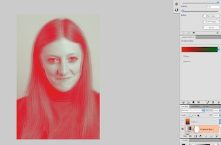
Image in the style of Nadav Kander


 There are two ways that I will be discussing you can create this type of image.

The first few steps are the same in both ways.

1.  Change your image to black and white.
2. Copy your background layer.
3. On the top layer change the opacity to somewhere in between 30% and 50%.
4. Use the move tool to move your top layer slightly over so it has a blurred affect.
5. Then add a layer mask, using the a black brush go over the main features so that they don't look blurred as the bottom image will be seen.


These next steps are either or...

1.  Use the gradient map adjustment layer
2. Click on the slider to decide what colour you want.
3. Use the blend modes to see what looks best.

(these top two screen shots was using this method)

1. Use the gradient tool, this is on the same button as the paint bucket.
2. In the top left there will be the slider to decide what colour you want again.
3. Use the blend modes and opacity until you are happy with your image.


This image was done with the second method and I personally think it worked out better. The colours are blended better and doesn't look as harsh.

Sunday, 13 October 2013

duo tone


Duotone is a image made up of only two images (traditionally black and another colour). Normally used to bring out middle tones and highlights of an image, most common colours that are used are blue, yellow, browns and reds. Now because of digital manipulation programs such as photoshop, duotones, tritones and quadtones can be very easily created.
To create this image I used the presets that are on the duo tone.


Click on the colour box to decide what colour and shade you want .
Add more colours to create a tritone or quadtone.

Next to the colour box there is a graph click on this if you want to change the contrast of that colour.


Lorretta Lux


Loretta Lux was born in Germany in 1969 and is a fine art photographer known for her surreal portraits of children. In all of her images the colours are desaturated and the eyes have been made bigger. Personally her work interests me because of how different and unique it is.

Double exposure


Using the opacity slider

Using blend modes


Open images in photoshop making sure that both images are visible, use the move tool to place image A over B (or B over A) make sure you hold the shift key while moving this will place the image centrally over the image. Next you can either use the opacity slider to make the bottom one viable or you can use the blend modes.  Personally I think the blend modes looks better.

Monday, 7 October 2013

Health&Safety on computers

When working with computers there are a few things that you should and shouldn't do, a few of these being:

  1. Keep all food and drinks away from the computers.
  2. Take a 5 to 10 minute breaks for every hour you spend looking at the computer screen.
  3. Have an adjustable chair.
  4. No trailing wires 
  5. Have a screen that can tilt.
  6. PAT testing.
  7. Have the correct seat height and posture for yourself. 
If you don't follow health and safety when using computers here are a few things that could happen:
  1. Eye strain.
  2. RSI
  3. Back problems.
  4. Electrical problems if drinks are get on/near the wires or computer/laptop. 

Solarised image in photoshop

To create these images I followed this tutorial:  http://hub.tutsplus.com


Black and white

To create an image like this follow the steps in the link above, however miss out the steps about adding clour. This worked better in black and white however I still think that solarisation works better in the traditional dark room.
Colour 

Follow the steps in the link above to create this type of image.